UI bundles
Start with the short introduction to bundles at Your first command.
See Bundle metadata for the bundle.yaml file and Bundle lib and bin for the lib/ and bin/ folders.
The other bundle types are on Command bundles and Advanced bundles.
UI bundles are designed to create easily sharable UI layouts for the Command Bundles
A UI bundle is a bundle that can contain command bundles and other UI bundles. There are some limitations depending which version of Revit is being used however pyRevit is usually smart about these differences.
All UI Bundles
The requirements and conventions below are shared among all UI bundles
requires:
    - bundle.yaml         # includes bundle metadata e.g. tooltip message

optional:
    - icon.png            # for Revit UI icons
    - icon.dark.png       # for Revit UI icons in Dark mode
    - lib/                # can include a lib/ directory that hosts modules required by the commands inside this bundle
    - bin/                # can include a bin/ directory that hosts binaries required by the commands inside this bundle
Bundle Layout Directives
UI bundles can provide directives on how the child bundles should be ordered in Revit UI. Since pyRevit 4.7, the primary method to provide these directives is to use the Bundle File. These directives are defined in the bundle file and are limited to UI bundles only.
See Bundle Layout for more information about layout directives
Example
# layout directives are listed in order under `layout` key
layout:
  - Logs
  - -----
  - Unit Tests
  - Bundle Tests
  - Misc Tests[title:Third-Party\nUnit Tests]
  - Debug Dialog Config
Tab UI Bundle
This bundle creates a Tab in the Ribbon with the bundle name. The rest of the required and optional components are identical to All UI Bundles
Panel UI Bundle
This bundle creates a Panel in a Ribbon Tab with the bundle name.
Panel Background
You can set the background color for main, title, and slideout parts of a panel in the bundle metadata file. The colors are in CSS style and can be in ARGB or RGB format. Note that colors need to be wrapped in quotes since # is a comment character in YAML
# set background for all parts
background: '#ff0000'                   # or ARGB e.g. #ff0000ff

# or for individual parts
background:
  panel: '#ff0000'
  title: '#00ff00'
  slideout: '#0000ff'
Collapsing Panels By Default
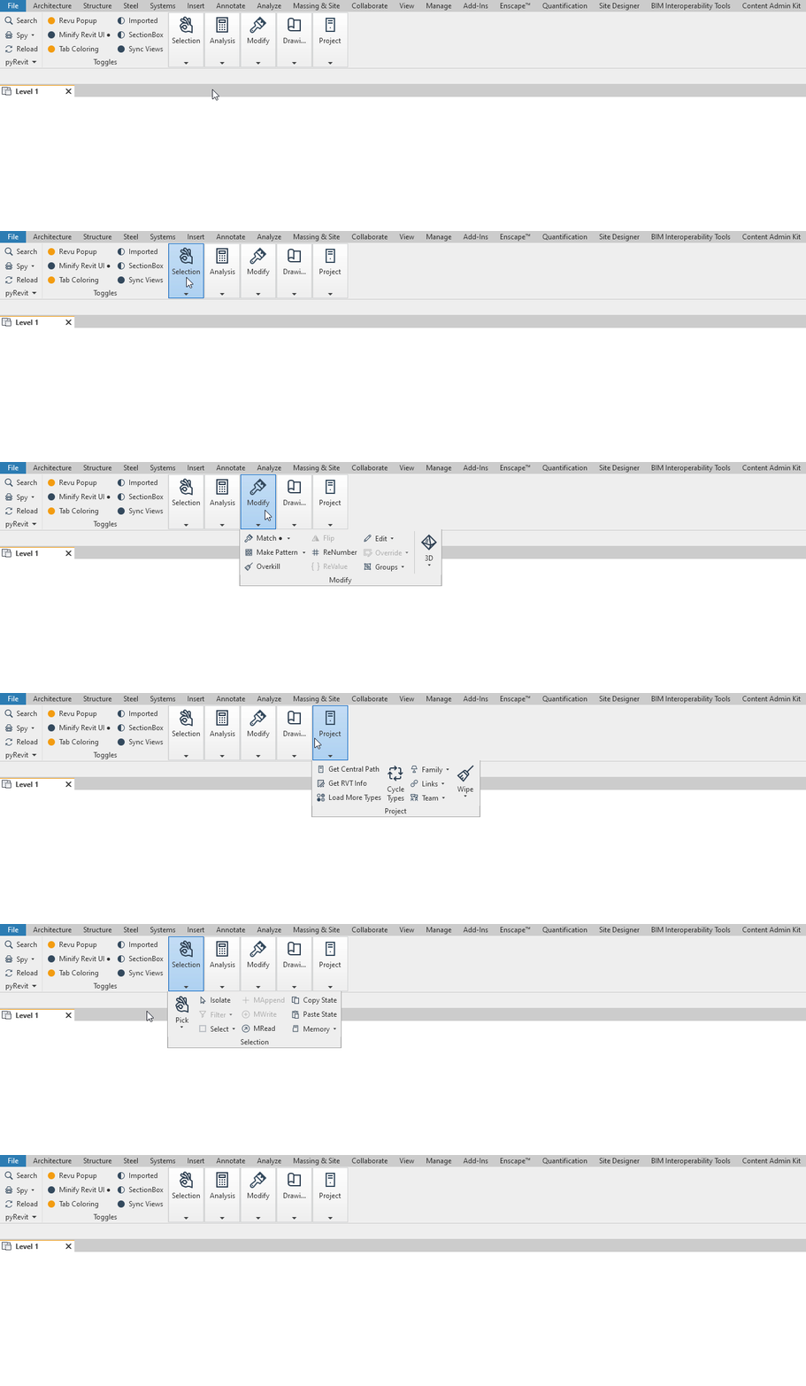
If you have a lot of panels on your tab, you might want to set some of those tabs to be collapsed by default so they don't take space on the tab bar. Users can hover over the panels to see the tools. Set the option below in the Panel bundle file.
This is how the panels would show up (collaped) and expand when user hovers over the panel.
Stack UI Bundle
extension: .stack
can_contain:
    - Pull-down UI bundle
    - Split-button UI bundle
    - Split-push-button UI bundle       # Revit 2018 and later
    - All command bundles

max_children: 3 bundles total (of any kind)
Pull-Down UI Bundle
This bundle creates a Pulldown Button in a Ribbon Panel or a Stack, with the bundle name and icon.
Split-Button UI Bundle
This bundle creates a Split Button button in a Ribbon Panel or a Stack, with the bundle name and icon.
Split-Push-Button UI Bundle
This bundle creates a Split Push Button button (The sticky split button) in a panel or a stack, with the bundle name and icon.
This bundle creates a stack of 2 or 3 buttons in a panel.